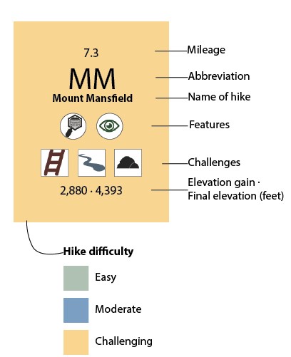
This data visualization is inspired by the Periodic Table of Elements to categorize my 2020 hikes.
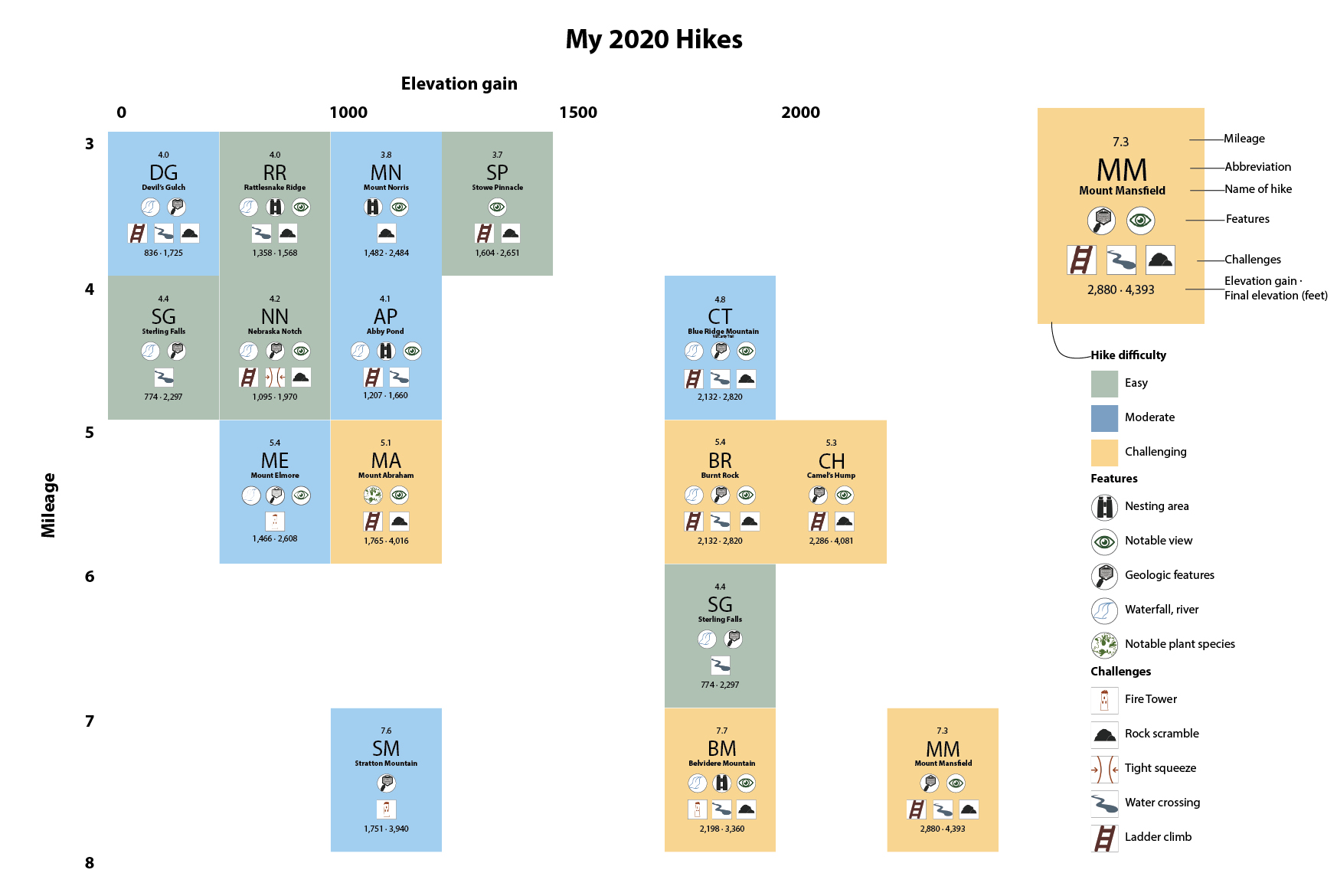
I created a visual iconography to allow for an ease of interpretation, using colors to indicate the hike difficulty. The top number indicates the length of the hike and the range of numbers indicates the elevation change of the hike. The icons show different features and challenges of the hikes. The placement of each card on the grid shows the viewer at a glance the length of the hike as well as the total elevation gain.
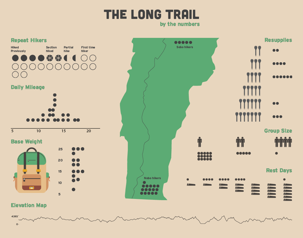
I collected data from approximately 20 individuals who hiked the Long Trail and compiled a cohesive document to display the data.
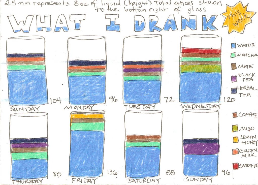
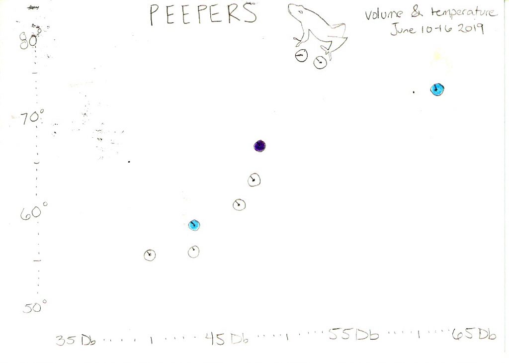
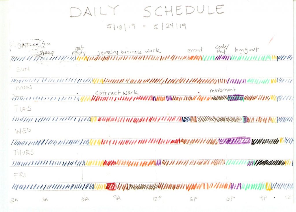
Personal project based on the book Dear Data where I collected data weekly on a subject and then created a hand drawn visualization on an index card using pens and colored pencils.